If you’re unsure about the media output switcher in Android, you’re not alone. However, if you regularly play music on your device, you likely use it every day without even realizing it. This feature appears to be undergoing a significant redesign in Android 16. Although this update isn’t exactly revolutionary, it does feel substantial due to Google maintaining a similar design for this aspect of the Android interface for quite some time now. It’s noteworthy when they keep something consistent over such an extended period.
A recent report from Mishaal Rahman at Android Authority reveals that the media output switcher has received an updated appearance in the newest Android beta release. Last week, Google released Android 16 Beta 4, and snippets regarding modifications in this software iteration have begun surfacing online. With each passing day, additional discoveries continue to emerge as users engage more deeply with it. These updates are not extensive; they do not signify a complete revamp of Android’s user interface. Instead, Google seems focused on refining specific components within the system. This approach can particularly be seen in the redesign of the media output switcher included in the most current Android 16 Beta build. According to Rahman, this refined layout aligns better with Google’s principles for Material Design 3.
The media output switcher in Android 16 might not make it to the stable release.
Although this visual update has been integrated into the beta version, it does not guarantee that Google will include it in the stable release. Nonetheless, it’s quite likely that this design could persist even after Android 16 rolls out completely in June.
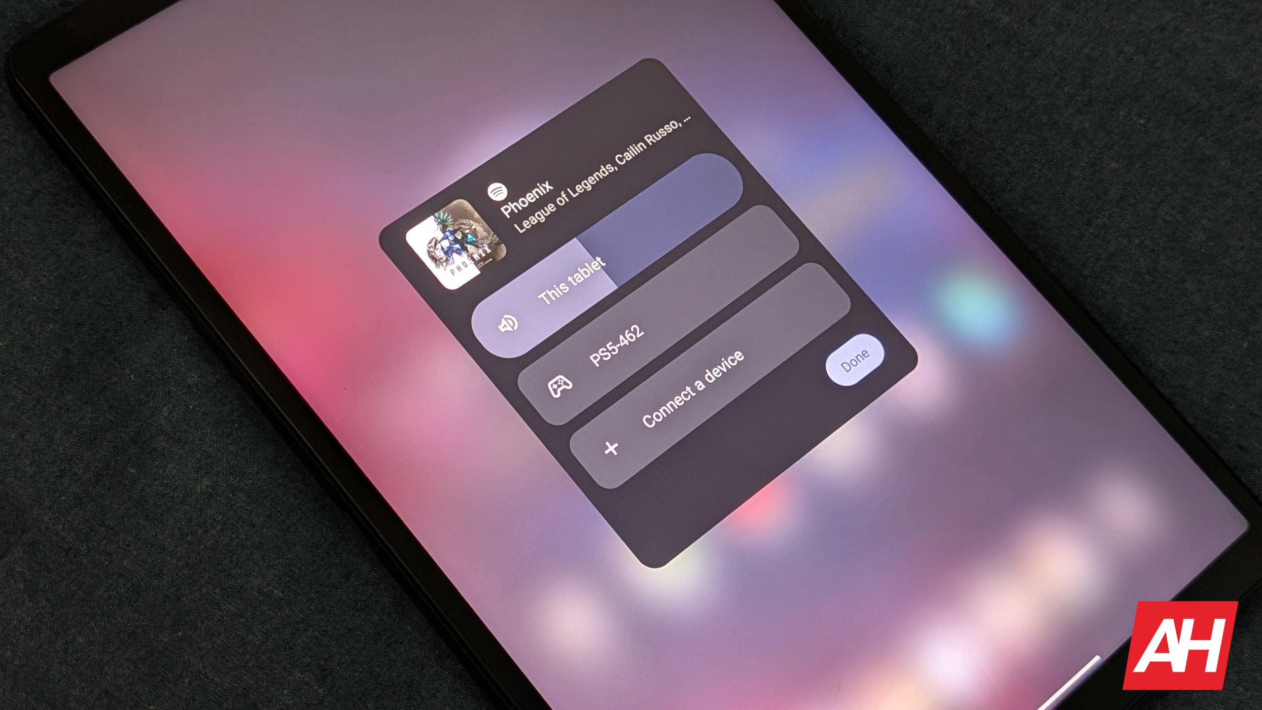
Currently, Google is “testing” this design and might be interested in seeing user feedback. Don’t worry if you’re not familiar with the media output switcher; that’s perfectly fine. It can be found within the notification for whatever audio is currently playing. For instance, when streaming content via apps such as Spotify or YouTube Music, a notification appears indicating active playback. At the upper-right part of this notification lies a small button known as a chip, which displays the current device handling the sound—be it your smartphone or paired earphones.
Once you touch that chip, the media output switcher panel appears. It primarily aims to provide a straightforward method for choosing a different device to handle the audio playback. This particular part of the user interface has undergone several modifications. As Rahman notes, it hasn’t been updated aesthetically since Android 11. Besides having headings that identify the devices as speakers with accompanying visuals, Google is now making more substantial alterations to portions of this design.
Certain modifications introduced by Google improve things, while others do not.
Initially, the speakers and display section no longer features a pill-shaped container for various listed devices. Now, the list includes solely the device names without additional enclosures. While this change doesn’t pose a significant problem, it lacked some visual appeal compared to how Google presented things in Android 15. Additionally, one might think that removing distinct boundaries around each entry could increase the likelihood of mistakenly tapping an unintended device. However, I suppose that point may be considered trivial.
Secondly, Google has relocated the button for connecting a new device. In previous versions of Android up to version 15, this button was placed within the list of devices in the media output switcher and stayed fixed at the bottom. If you needed to add a new device, you would go through the list of devices shown in the media output switcher until you reached the position just beneath the entry for the most recently used device where the connection button appeared.
In the updated layout, this button is positioned at the very beginning of the media output switcher. You’ll notice it visually immediately after the indicator showing what’s currently being played audibly. This adjustment really simplifies locating it since scrolling down isn’t required anymore when connecting another gadget. Instead, everything is conveniently within reach. To sum up, this appears to be an enhancement aimed at user comfort. People are likely going to appreciate this modification quite a lot.
Regarding the final update, Google has refined the volume slider within the media output switcher. It now boasts a sleeker appearance with an added line inside the slider bar, making it simpler to identify the current volume setting compared to previous versions where it might have been slightly less obvious. Additionally, this revamped version ensures better visibility thanks to the prominent line indicator. Furthermore, the slider includes a small symbol representing the connected audio device—such as headphones or speakers—which adds clarity about which device you’re adjusting. While these modifications may seem subtle, they contribute to a cleaner overall interface.
The post
The Android 16 beta updates the user interface for the media output switcher.
appeared first on
Android Headlines
.